
HOW TO CREATE A COHESIVE COLOUR STORY THAT SELLS
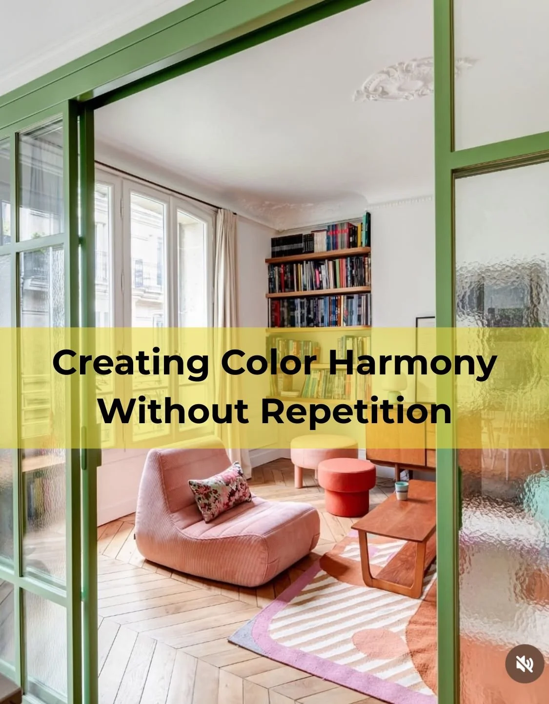
When you’re planning a flip, it’s easy to think a “cohesive look” means using the same colour in every room.
But buyers don’t connect with repetition.
They connect with flow.
Flow is what makes a property feel considered, room by room, yet still part of one whole.
It’s what makes people walk through the door and feel:
“This just works.”
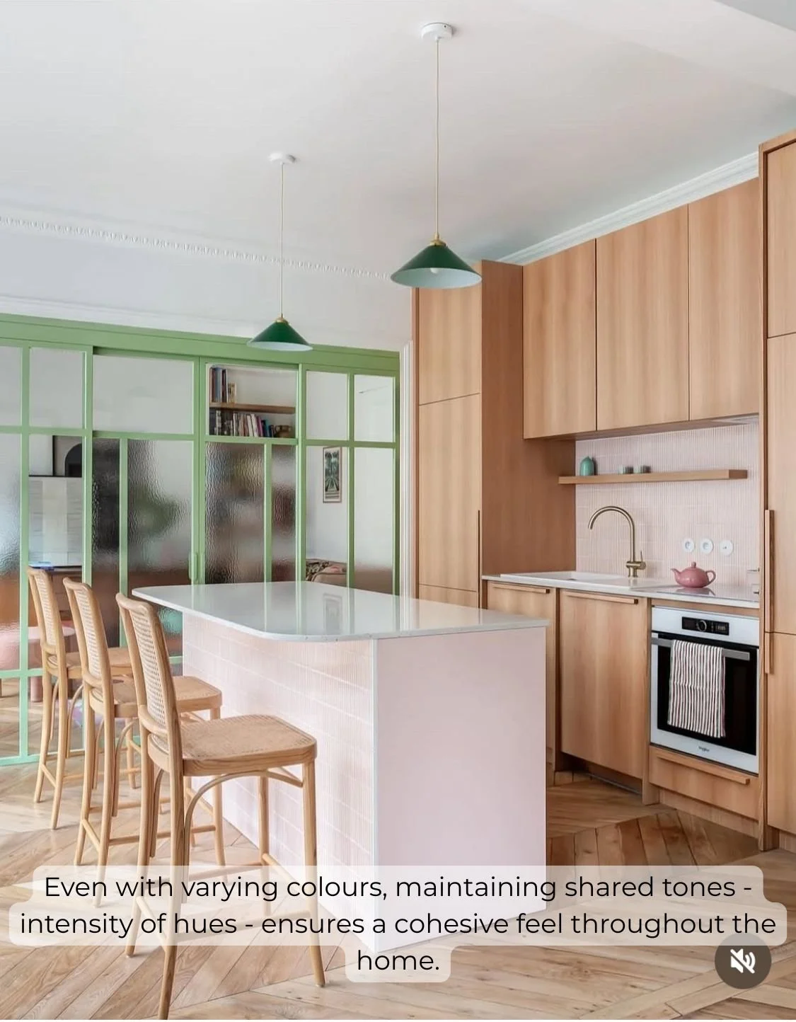
Image Credit: Cose Di Casa
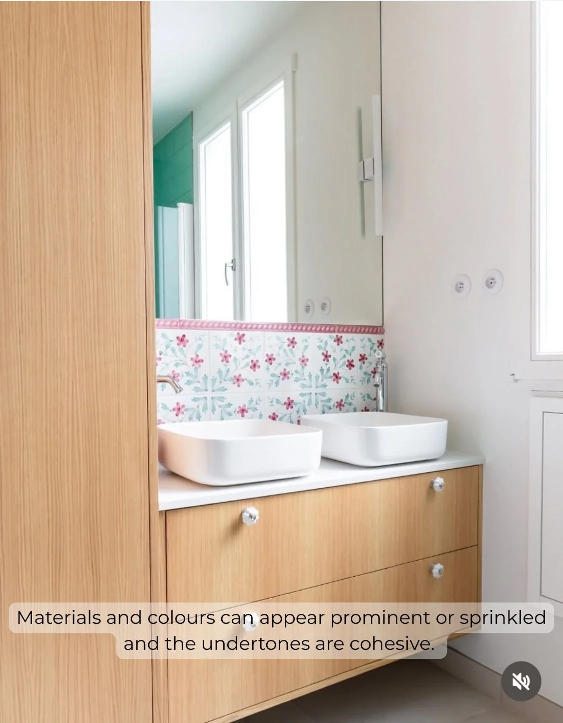
Image Credit: Cose Di Casa
Here’s how to create that feeling, without being matchy-matchy:
Keep undertones consistent.
Even if the colours change, sticking to the same tone family (like warm, earthy shades) keeps things feeling balanced and connected.Echo, don’t repeat.
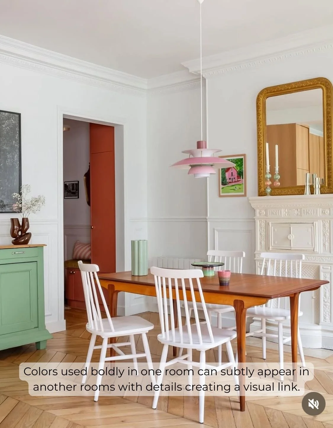
A bold colour used in one room can reappear in a cushion, artwork or small accent in the next. That kind of echo feels intentional—never forced.Repeat materials and finishes.
Timber, brass, rattan, linen—when these elements show up throughout the house, they create a visual rhythm that holds everything together.Carry the mood across.
If one room feels calm and layered, and the next feels cold or disjointed, buyers notice—even if they can’t explain why. Mood matters. And emotional continuity is what creates perceived value.
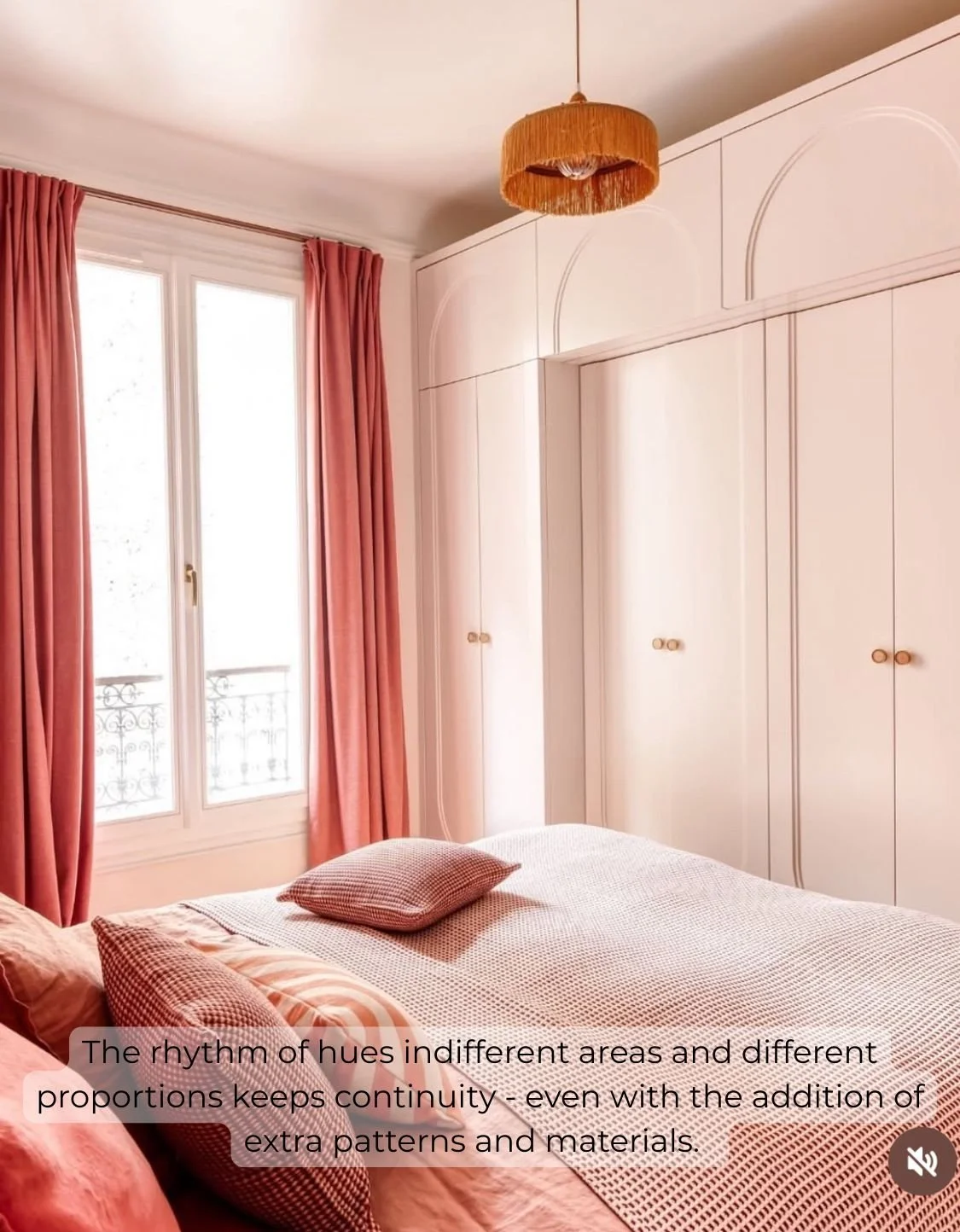
Image Credit: Cose Di Casa
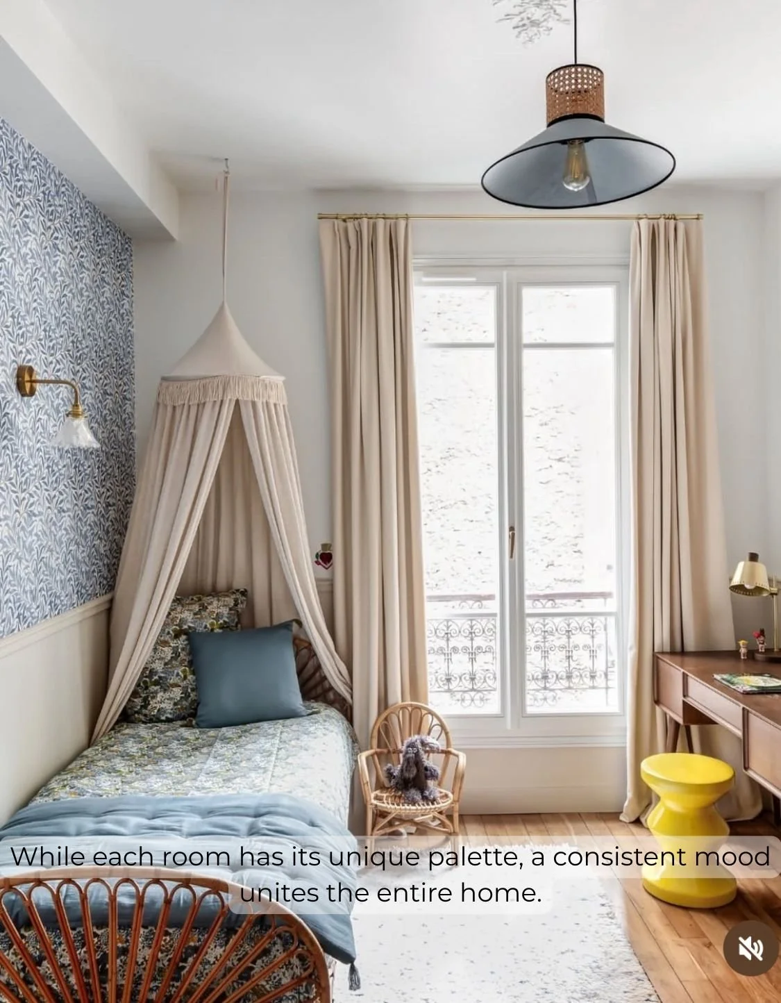
Image Credit: Cose Di Casa
Here’s what to avoid if you want your flip to feel connected:
Don’t treat each room like a separate world.
Jumping from minimalist to boho to glam breaks the story. It feels like five different properties under one roof.Avoid dramatic shifts in tone.
If one room is calm and neutral, and the next is loud and playful, the energy gets confusing. That confusion = doubt.Don’t mix undertones carelessly.
Warm beige next to icy grey, or terracotta against mint, creates visual tension, not harmony. Even neutrals can clash.Avoid over-theming.
Buyers aren’t looking for a jungle room or a Parisian powder room. They’re looking for a home that feels well put together.
A brilliant example of this kind of flow is a project by Mira et Mervailles Studio (featured in Casa Facile).
Each room has its personality, but they all belong to the same world.
Warm tones echo across spaces
Mood stays joyful but grounded
And variety never becomes chaos
That’s the difference between a house that feels curated… and one that feels disconnected.
This is what buyer-led renovation looks like.
Not just matching paint colours.
But guiding every decision—colour, mood, layout—with intention.
Because when a home feels right, buyers move faster.
And when buyers move faster, you make more profit.
Project: studio @mursetmerveilles. Foto @sophielloydpro Styling @celinehassenpro