
HOW TO MIX COLOURS TO SHAPE THE FEELING OF A ROOM.
Here’s the shift:
Stop describing the room by how it looks.
Start defining how it should feel.
If you want your renovation to sell faster and for more, the goal isn’t to make it “look nice.”
The goal is to make the buyer feel something.
That emotional pulm, calm, joy, energy, connection, is what makes a space memorable.
And one of the most powerful ways to create it is through how you combine colours.
Here’s the shift:
Stop describing the room by how it looks.
Start defining how it should feel.
Not “airy” or “bright.”
Think “calming,” “comforting,” “uplifting.”
Because it’s that feeling that helps the buyer imagine their life there.
That’s what sells.
Start by choosing two emotions you want the room to evoke. Then, build your colour choices around that.
Here are three approaches that change the energy of a space:
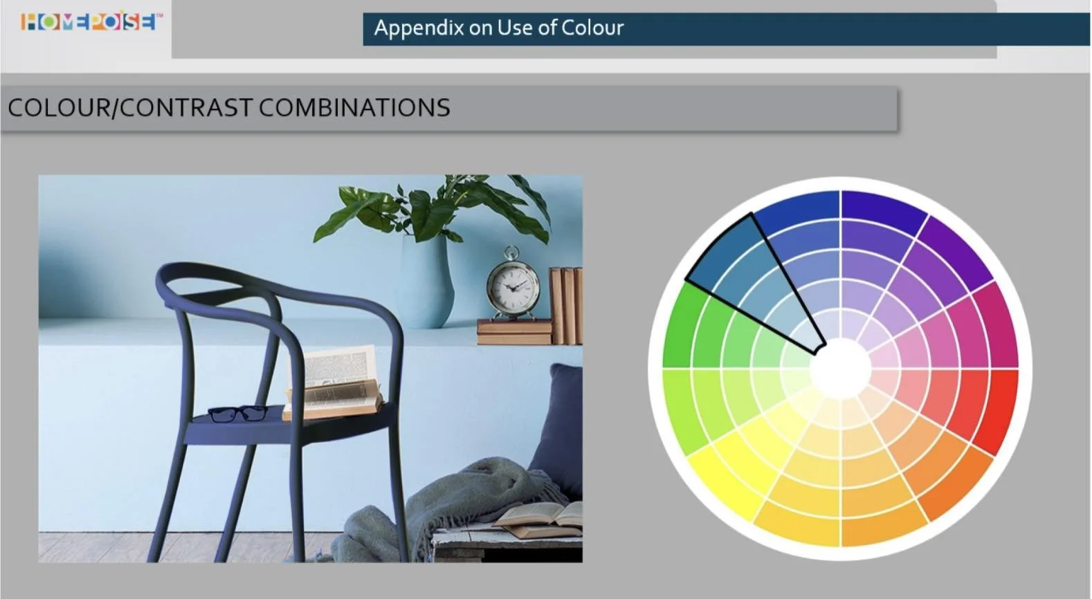
1. Monochromatic: same colour, different shades
Think pale blue, denim, navy, all from the same family.
Effect: Sophisticated, cohesive
Mood: Calm, grown-up, elegant
Tension: Low
Use this when you want the room to feel controlled and serene. Think bedrooms, home offices, or anywhere you want a sense of stillness.
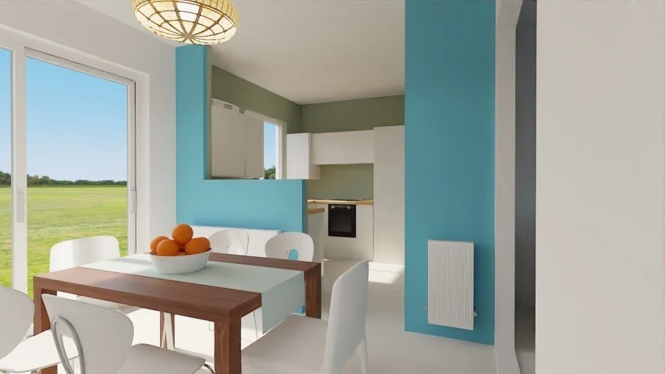
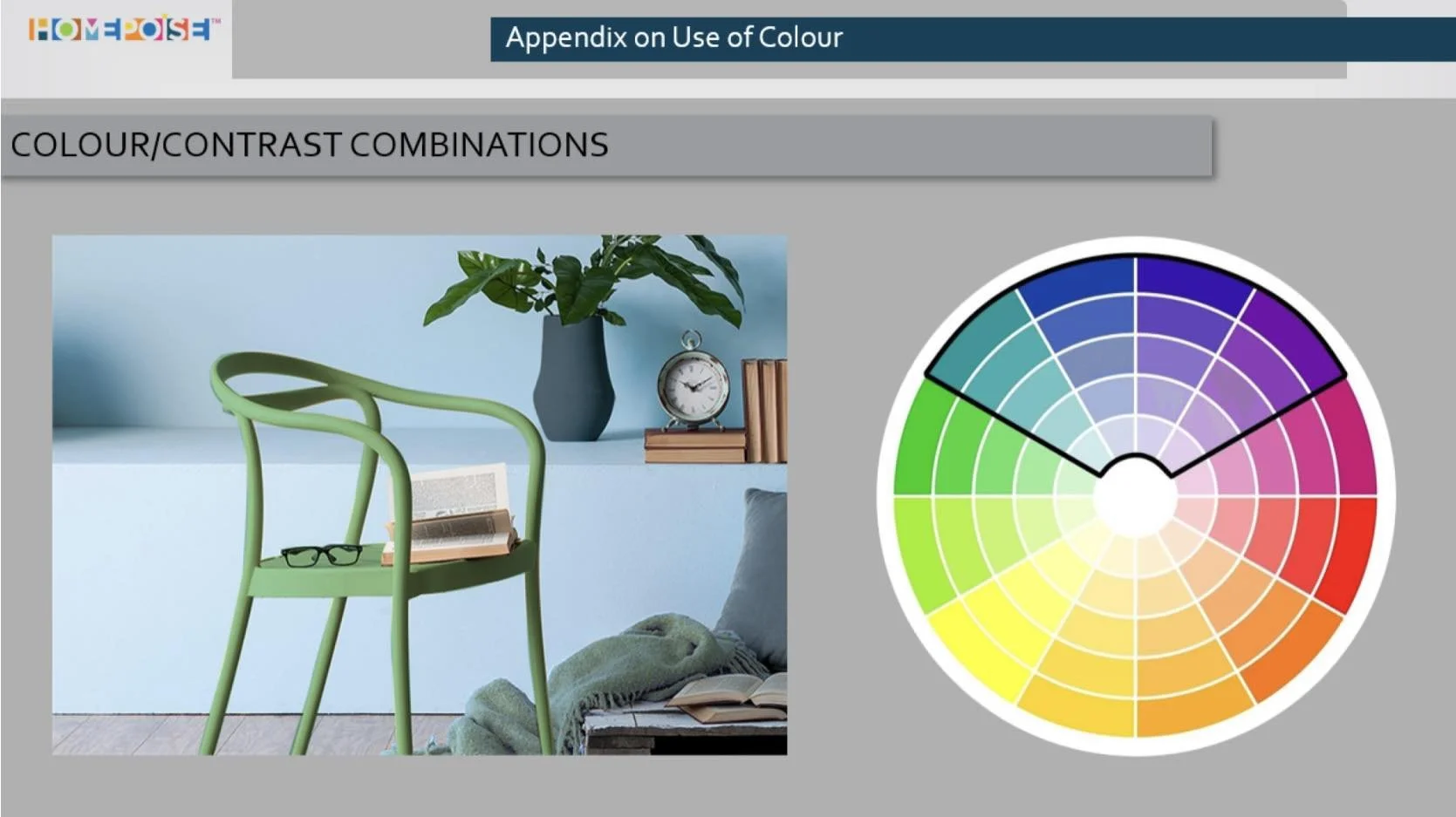
2. Analogous: colours that sit next to each other
Blue + green. Yellow + orange. These create flow without clashing.
Effect: Natural, gentle movement
Mood: Comfortable, connected
Tension: Medium
This is perfect for living rooms or family spaces, rooms that need warmth but not noise.
3. Complementary: opposites on the wheel
Red + green. Blue + orange.
Effect: Bold, high-energy
Mood: Playful, dynamic, lively
Tension: High
Use this when you want impact, entrance halls, kids’ rooms, or anywhere that needs a strong first impression.

The science behind the mood
Colour isn’t just visual, it’s physical.
Cooler colours have shorter wavelengths. They soothe.
Warmer colours have longer wavelengths. They energise.
And when you understand this, you’re no longer just picking colours that match.
You’re creating a response. A mood. A memory.
And that’s when buyers start to connect.
That’s when the home feels right, even if they can’t explain why.
Colours don’t just look good. They work.
They support the story you’re telling.
They drive decisions.
They help your renovation sell faster, and for more.
Because when you flip with purpose, every colour counts.